
I redesigned, branded, and built the website for New York based magician, Rachel Wax, to increase bookings and better represent her aesthetic.
Project Goal
Create a website that reflects who Rachel Wax is, why she is a great magician, where to see her perform live, and how to hire her.
Problem
Website does not clearly show her work, where she performs, and does not reflect her personal style.
Solution
Redesign and rebuild website to better showcase and reflect Rachel's style in performing and her past and current gigs.
The Client
My client, Rachel Wax is a New York based magician. She performs at private events and ticketed shows in New York and surrounding states. Most of her business is word of mouth. Potential clients review her website to learn more about her. Rachel wants to update her website to increase her bookings and stand out from other New York magicians.
Research
Insight
Only 13% of magicians in the United States identify as female. Combined with her fiesty persona, I wanted to highlighted that she is a woman in magic to help her stand out.
Most of Rachel's videos and photos are behind play buttons or in other pages. Competitor websites place the majority of their content on the home page and videos play automatically. Rachel needs to remove any obstacles to viewing her videos and photos.
I researched various entertainers websites, focusing on magicians in the New York area. I analyzed what type of information was shown on each website and what type of audiences and successes these magicians had. I then selected videos, photos, and testimonials that I thought would make Rachel stand out the most and capture the most interest. I used these selected visuals and text to guide me as I designed the wireframe.

Home
About
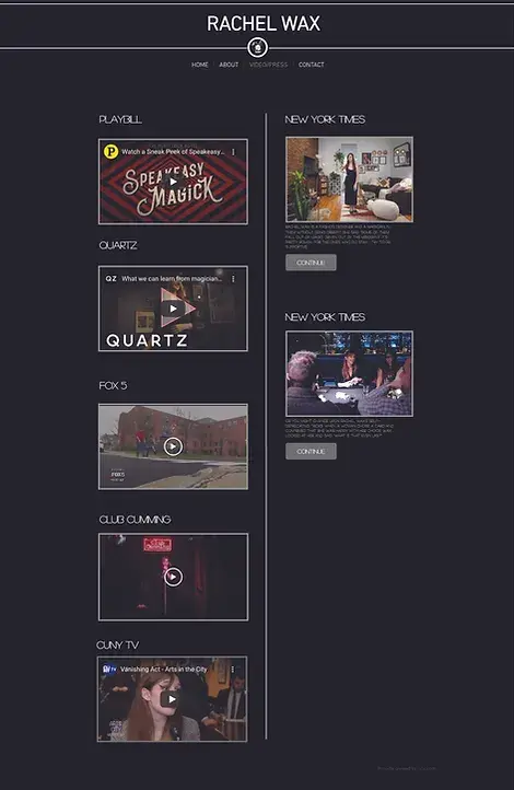
Videos
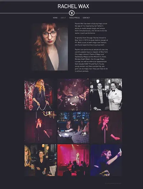
Previous Website
Here are screenshots of my clients previous website. It has a lot of content, but is awkward to navigate and doesn't reflect her playful and feisty persona.
Wireframe
Insight
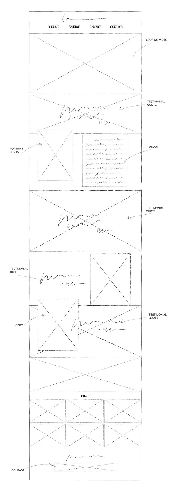
The homepage needs to be a story and take the user on a journey.
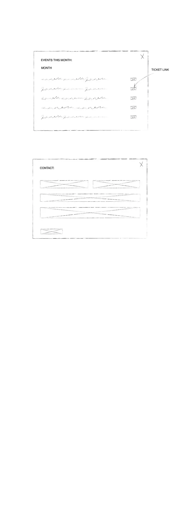
The information architecture divided this website into 5 sections - 3 pages and 2 overlays. The home page would be an engaging "journey", touching on the most important facts about Rachel. A videos page would host all videos and a press page will showcase all press. Contact forms and links to purchase tickets will be on pop up boxes.
This is the first draft wireframe for the home page and pop ups.
Design
Insight
Less is more - my client's photos and videos mostly spoke for themselves. My job was to curate them and lead the user to hiring her.
A Journey (at) Home
Using the many expressive videos, photos, and testimonials my client provided, I created a visual journey on her home page. As the user scrolls, they are introduced to who Rachel Wax is and how she has already made an impact in the world of magic.

Conversion to Tickets and Booking
The main goal of this website was to increase her conversion of ticket sales and clients. I designed pop up boxes for the contact form and ticket sales so users can easily access them anywhere on the website.

Curating Videos and Press
Users were previously spending approximately 30 seconds on the previous home page, that only had 1 video. Videos and press are an important part of Rachel's career. To direct more attention to the growing number of videos and press my client has, I designed and curated separate pages for her videos and press.

Hand Off
Once my client approved the design, I created the website on Wix Studio. Once complete, I walked my client through her new website and provided her with reference documents for when she needs to update her shows and press.